
Incorrectly designed stores, in terms of usability, is one of the most common causes of low conversion and cart abandonment. From slow loading time, poor mobile optimization, or a lack of navigational user-friendliness, there are tons of elements that some online stores fail to correct. It’s a lot easier to close a page online than it is to leave a store- so why give your customers the slightest reason to jump to a competitor’s site? When conducting a User Experience (or UX) audit, you should be aware of a few key areas – finding them quickly and thus improving your website quality can contribute to a significant improvement in business results. Below, I wanted to present the top 7 areas that require special attention.
1. Sign-up Forms and Account Creation
This is a critical area for any e-commerce business. If a user enters the first step in the purchasing path, then it means they have already made a preliminary decision to purchase. However, it doesn’t mean they will complete the path. Along the way, there are a lot of traps and difficulties. The very creators of the store are most commonly the biggest culprits. Forms can be long and tedious, and potential customers often have trouble understanding commands and method of inputting data. Some customers might bounce simply because they don’t want to create an account. In any case there are several potential errors that many e-commerce owners make when creating their store’s checkout process:
Missing or wrongly operating validation
Poor form functioning makes it hard for the user to go easily through the form. At best, it might fail at helping a user avoid a problem with their delivery information. At worst, it might entirely block the user from moving forward, or cause them to bounce from your site. Notifications about mistakes that have occurred should be concise – the user won’t is able to fix his mistake if he doesn’t know what he did wrong. Try not making the forms too inflexible, sometimes delivery options won’t always fit into the mold- and being able to send a follow up email for more information is the key to getting their product delivery right.
Forms are too complex
There is nothing that deters users more from placing an order or registering in a store than a long form which might look overwhelming. Long and complex forms might seem scary and deterrent. If we have to have such a form, then it is much better to break them into shorter more accessible parts. It will be easier for users to focus on shorter forms that seem simpler and quicker to fill out.
In any case, it is always good to discuss things through and test forms, because in the end it might come out that most of the information isn’t so necessary after all. In many cases, e-commerce owners have discovered that requiring less information at signup improves their conversion rate. Just make sure that you’re getting the information that’s absolutely necessary.
Lack of information on how (and why) to enter some data
A notoriously bad mistake is the greedy need to collect as much data about the users as possible. The users however, aren’t always so ready to give up their personal data. Especially when they don’t know where and how this data will be used.
Firstly, companies should be really careful with their attempts to take as much data as they can. Second, if they have to ask users for some personal data, for example phone number, there should be some kind of note that can explain to the user why this information is needed and how it will be used. Any way that you plan on using the data from your customers should also be mentioned in your privacy policy located clearly on your site.
2. Shopping Cart Optimization
The shopping cart is one of the most important functions of an online store. Here, users store products to keep an eye on and those they are going to buy. Again, adding a product to the cart doesn’t mean success yet and doesn’t mean that the customer will buy the product. The key here is a summary of all costs, additional charges (if any) and the delivery fees. If we hide any additional costs, the users may feel cheated and abandon shopping.
Lack of a clear summary of all costs
A lack of a clear rundown of all products, their cost, and potential delivery information is one of the most prominent mistakes when it comes to shopping cart optimization. Information about all costs included in the purchase are required for each and every user. If it’s not readily available, they might feel surprised and cheated when finding all the additional costs on the purchase confirmation page. Disappointed, they might leave the store and abandon their purchase. Whenever possible, we should inform users about the delivery costs as well.
There are ways to prevent customers from abandoning their carts. In order to prevent the cart being used as a storage device for products that interest your customers, try providing a wish list that will incite customers to save products they like. Also, providing a delivery estimate that automatically updates when your customer adds items (perhaps with an estimate based on their zip code) is especially helpful in giving your customers a better idea of their overall cost.
Changes in the cart do not update automatically
The users often have to move back to the cart because after they entered the checkout process they noticed that something is wrong with their order, for example, the number of products is different than intended or some products didn’t update. The reason for that might be that the cart isn’t updated automatically. Having to refresh the page for the cart to update is adding yet another step in your user’s checkout experience- which is, as you guessed, another opportunity to leave your store.
No information about transaction and data security
One of the reasons why users leave the checkout process is the lack of trust in the webstore. Users might feel unsafe with placing an order in the situation when there is no proof of security. Awareness that the company is protecting users’ data is really important for customers, not only on the Internet. This can be achieved by making sure that your store is equipped with an SSL certificate, which shows your users that your site and server are secure and that their personal data is protected.
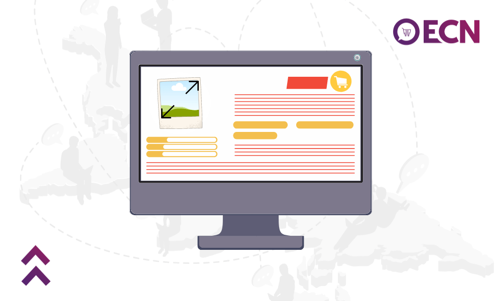
3. Product Page Optimization
Customer’s decision to purchase a product is often made when viewing a product page. Your product page is the most important element with which your customers will interact before deciding whether or not to purchase your product. For your user to become your customer, you need to present the product in a good light and provide the customer with all possible information. Here all the possibilities to configure the product have to be presented, e.g. choosing a color, size or other available parameters.
Low-quality image of a product

Good looking photos are one of the most welcome elements on the product page, especially in visually driven industries like fashion where products are purchased purely based on visual attributes. In all cases, with the visually driven customers of today, users will demand good quality photos. Functions, like zooming into the image and focus on details is a must-have these days.
Lack of clearly communicated product benefits
What are the unique selling points of the product or the store? Why should the customer place an order in that store and not another one? If retailers want to gain new customers, they have to fight for them and show them their advantages over the competition. Giving information about your product is the best way to convince your customer to purchase from you and not from your competitor. If you have a differentiation point, it’s important to make that known even on the product page to ensure that your customer understands why they should choose your store.
No recommendation of other products or upselling
Product recommendation has a lot of advantages, and it’s good to use them wisely. Recommendations are a good place to present other kinds of products which the user may not have previously thought about. It’s useful to show the scope of products available in the store and it can help the user move forward in case they have a problem in finding the right product. Bestsellers can also act as good social proof for your customers.
4. Internal Search Engine
In order for a customer to buy something from your e-commerce store, they first have to be able to find it –and most users do this via search engine. Whether users find what they are looking for or abandon the store depends on how well it functions. Commonly, improper functioning of the engine causes the user to draw a false conclusion that the product is not available, where in fact the fault is in an improperly operating search engine.
Lack of error correction and hints
The most serious problem with the search engine is demanding the user to use and understand page jargon. Customers come from different places with their own habits and knowledge. They can use different terms to name the same products. Search system should be prepared for that, and compensate for synonyms, similar products, and multiple languages (especially if you have international visitors).
No suggestions of products and categories
It is good to show some product suggestions in the search bar dialog box. We can use this to show the user some promotional products and popular brands. It can also build scope awareness of the available products.
A page with no results is a dead end for the user
In a situation where the user is landing on a page with no results after searching, the page should show them some sort of alternative. The worst possible scenario is when the user is only shown that there is no product that responds to their search. Such a page is like a dead end and users often leave the site in this situation. A good solution is to show alternative products that might be similar to the search or interesting categories that might respond to your customer’s needs. This is especially true for mobile users.
5. Product Filters
This is an area which is often under-appreciated and difficult to design. Users need a tool that allows them to move around an often overwhelming number of products and filter them according to their needs. The difficulty with filters is how to show many options in an accessible and legible form, allowing for quick changes to the product list. Without it, users won’t be able to properly browse the offer and may leave the website.
Filters aren’t working correctly
The same filtering on the page can hide a lot of mistakes. Sometimes filters are hidden on the left side of the window where they go unnoticed. Sometimes the way they are designed makes it difficult for the user to decide which filters are currently selected, if any. There might also be a problem if you do not know how to disable the selected filters. Of course, the most unacceptable mistake is when filters don’t work correctly.
Selecting a filter reloads the entire page
This very inconvenient and uncomfortable situation can quickly cause frustration. It might work if you first select the filter and then use one button to make a page reload. It is much worse if, for example, the whole page reloads after selecting just one filter. Selecting multiple filters it the beginning of a dreadful experience. It forces the user to wait and can be very frustrating. If your user is on mobile, it might be the catalyst that makes them bounce.
Filters are too complex
Sometimes site creators forget about information architecture in their filters. It’s not all that rare to find the whole block of filters designed for the whole site and not for the individual categories. This will make your product searches more difficult for your users.
6. Navigation Optimization
Navigation is like a signpost – it directs users, helping them to find their way on the page. Main navigation allows users to see the scope of information on the page. This is a very important element on every page, but often designed with errors. On each side, good or bad navigation can make the difference between whether you will be able to convert a customer.
Poor information architecture
This is basic error. Nothing comes from an extended range of products if the users are not able to find specific items. Most commonly, users face problems finding a specific category because it is not clear to them. They end up asking themselves where it might be hidden. Solution? If your products fit more than one category, include them in several category. Just don’t go too crazy- it’s also frustrating to find the exact same products in each category.
Poor Mobile Navigation
Serious problems also occur with mobile navigation. Excessively extensive information architecture of desktop is difficult to scale for the small screens of mobile devices. In particular, the data hierarchy is really important. It’s important to understand that mobile navigation should be simplified, with easy large buttons that can be navigated smoothly.
Vaguely marked clickable and un-clickable elements
Poor graphic design can confuse the user about what is clickable and what is not. Thanks to visual chaos, some important information can be lost and sometimes the descriptions section or use of icons makes the individual functions not clear enough for users.
7. Mobile Store Optimization
These days we are inexplicably bound to our phones, thus having a version of your website adapted to mobile devices is a necessity. Mobile transactions now constitute about 35% of all transactions made in the e-commerce world. A cross-device trend is also gaining in popularity, providing a continuous shopping experience regardless of the device used. In light of these trends, not having even a rudimentary responsive mobile version of a store should be regarded as a major fault.
Website is heavy and takes a long time to load
A heavy, long loading site is a guaranteed conversion killer. Various studies suggest that customers are willing to leave a service which loads far too long. This is especially important for mobile users because they are even less likely to wait. You should aim for the shortest page loading time: approx. 2-5 seconds.
Small font size, problems with readability
Regardless of the size of the font on a page, it may be too small. Mobile devices are used under different conditions. Very often it is in a house, sometimes however, a bus stop. Medium sized fonts, for example 12 points, are far too small to consider as comfortable for reading from a mobile device. Also, remember to keep a sufficient amount of air in the text and a good layout.
Size of clickable elements not adapted to mobile devices
When designing for mobile devices we need to remember that users don’t have a precise tool like a computer mouse, instead they’re using their own fingers. The size of clickable elements must be considered, especially the smallest ones like checkboxes and radiobuttons. Small icons and button-links can prove to be problematic, especially when they are grouped close to each other. The minimal size of such clickable element should be between 7-10 millimeters.
Of course, these are not all the elements that you should pay attention to in the performance audit UX. You should also pay attention to other areas, such as those associated with SEO marketing. You should check whether the names and texts appearing on the site are not overly long and whether or not they make sense. In the event of any kind of instructions, you should pay attention to their clarity. All these areas should be the basis of every usability audit. That being said, the best way to appropriately audit your e-commerce is to ask people who aren’t involved with your business to try to navigate your site.
Regardless, UX is one of the most integral parts of making sure your e-commerce runs smoothly, and is converting your users into customers. What are your best UX optimization tips?