It’s no secret that humans are visual creatures. 90% of information transmitted to the brain is visual, and visual information is processed 60,000 times faster than any other type.
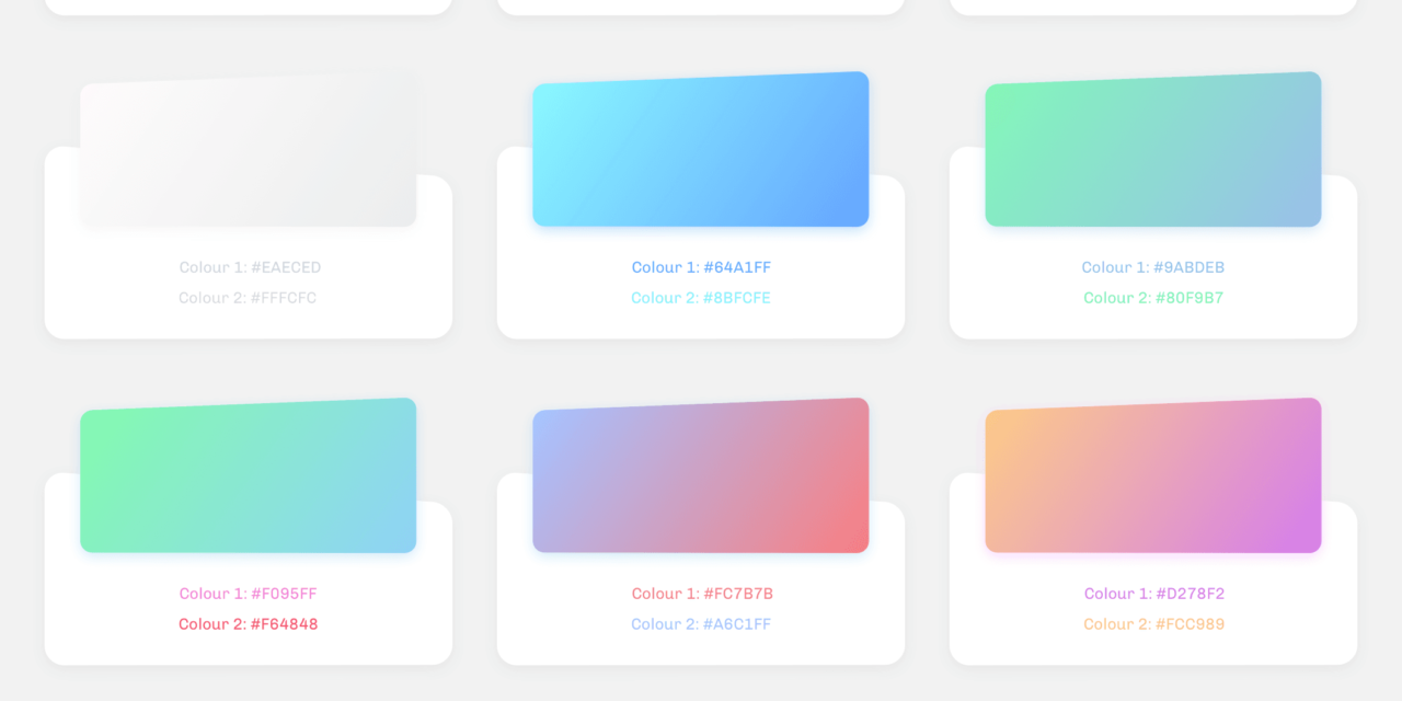
Color psychology has a real impact on our behaviors, and this includes purchasing behavior. When you’re working on your site, your colors should reflect your brand identity, your logo, and your motivations. The colors you choose for your E-commerce will have a direct emotional impact on the visitors and buyers on your site. We found a great infographic from KissMetrics about color psychology.
How Color Psychology Influences Buyers’ Emotions
Consumers place visual appearance and color over all other factors while shopping, and 85% of shoppers said color as their primary reason for why they purchase a certain project. Think about it, when was the last time you heard of someone who bought a car and didn’t care what color it was?

Color is the primary way we recognize brands. Using color in your branding increases brand recognition in 80% of consumers. Color is also specific to culture, and a color might have very different meanings between two cultures.
Before writing your marketing plan and creating your content marketing strategy, understanding the effects of each color on your customers will help you grow your business faster.
In North American e-commerce shoppers, the following colors provoke certain emotions:
Yellow:
Optimistic and youthful: This color is often used to grab the attention of window shoppers. Yellow evokes clarity and warmth. For example, IKEA and Mcdonalds both use yellow to make the buyer happy when seeing and thinking of their brand.
Orange:
Aggressive: Orange is great for calls to action like subscribe, buy, or sell. At the same time, this color makes a buyer feel confident.
Red:
Excitement: red is a primal color that is associated with urgency, which is why it’s most often used with clearance sales. This color is useful for spontaneous purchases and is bold when used with brands like Coca-Cola and Target.
Pink:
Romantic and feminine: This is the color most frequently used to market to women and girls for its feminine appeal. This color is used to create a feeling of softness and serenity.
Purple:
Creative and wise: Purple is used as a soothing color in shopping. This color is often the mark of creativity and imagination, which is especially effective for making the buyer feel that a product is luxurious or artistic.

Blue:
Dependable and strength: Blue is a serene color used to evoke feelings of trust and security in buyers. This is the go-to color for many banks and businesses for this reason.
Green:
Peaceful and healthy: This color is the best to use when you want to be relaxing, and associated with money, nature, and health. Green is actually the easiest for the eyes to process and is used to help calm a buyer.
Gray:
Balance and innovation: Gray is the color that we see when we think of technology- and for good reason. This color is anything but bland- and can be used effectively to symbolize neutrality, innovation, and knowledge.
Black:
Power and sobriety: Black can be a great color to use for E-commerce professionals looking to market towards luxury. This is a powerful color that can be used for a wide range of emotional responses.
Attract Online Shoppers with Color Marketing
Color not only provokes certain emotions in customers, it can also attract certain types of customers. To attract impulse shoppers, a deep red-orange color should be used. Black and royal blue can also be used for these kinds of buyers. We see this the most typically in fast food, outlet malls, and in clearance sales.
To target shoppers on a budget, use navy blue to attract customers needing to feel secure and teal green for relaxation. This is seen typically in banks and larger department stores. For traditional buyers, using pink and sky blue works the best, which is why these colors are used mainly in clothing stores.

While using these tactics is a great idea, it’s never just a color game. There are several other factors that influence shoppers. When color is used in conjunction with design and powerful call-to-actions, it really packs a punch.
A good e-commerce design is an important factor for many shoppers. 42% of shoppers base their opinion of a store solely on design, and 52% won’t come back to a site due to overall aesthetics.

Time is also an important element for E-commerce (and especially m-commerce). It’s no secret that a high drop-off rate is directly linked to a long loading time. However, you can use the time to your advantage by using colors that evoke urgency, like red, when you’re having a sale or you’re at the point of purchase confirmation.

You can also use powerful words to convert. Having a large clearance or sale banner across your website is a great way to get customers to go deeper into your site. You can also use these types of words to reassure your customer: 60% of consumers feel at ease and are more likely to buy a product that has the word “guaranteed” associated with it. This can be applied to your returns and shipping policies.
It’s important to think about the influence the design of your E-commerce site has on your users. By using design elements like color, power words, and striking visuals to your advantage, you can create an E-commerce site that makes the user into a customer.


