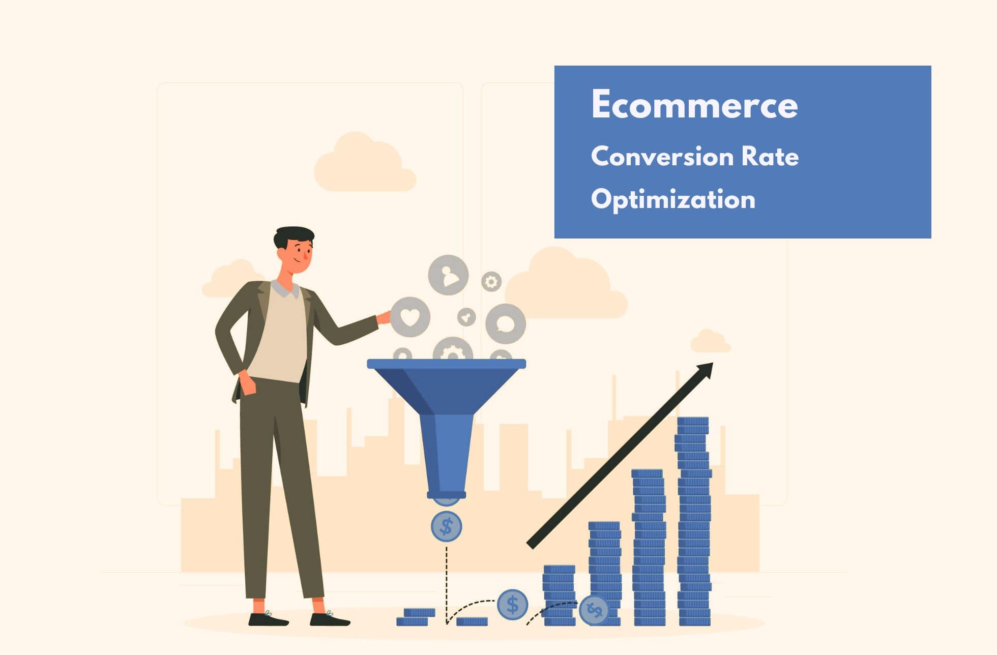
Getting a better shopping cart experience is a straightforward challenge. This is one of the most delicate stages in the process of making a purchase, and therefore most e-commerce makes numerous mistakes, such as forcing their users to register and lengthening checkout processes in excess.
Did you know that the percentage of abandoned shopping carts is around 50% and 80%, according to a ReadyCloud report? These percentages indicate that more than half of sales are lost in this last step. Not surprisingly, then, companies invest millions in delivering a better shopping cart experience to their customers.
Apple, Bellroy, Wallmart, Etsy, Amazon, Toys “R “Us and Zappos are some of the e-commerce who master the art of creating an optimal shopping cart experience. Their success is not only due to having a brilliant product or service. Their strategies to reduce shopping cart abandonment also influence the competitive advantage that separates them from their competitors.
5 Keys to a Better Shopping Cart Experience
Simplifying the forms to fill out, shortening checkout processes or placing the cart in a visible place are some of the keys to providing a better shopping cart experience.
In the following lines you will discover some of the best practices when shopping in e-commerce, which will help you combat cart abandonment. Do you dare to discover them?
Put the shopping cart in a visible place
If you have ever made a purchase online, you will have checked that the shopping cart remains always visible, even when empty. For many, this is just a commerce convention. In any case, it is important to keep this element visible, if possible in a blank header, always in the top right. One of the reasons to do it this way is the access to the checkout page where the purchase is completed.
Don’t force your customers to register
It is true that initial registration makes life easier for the consumer, in addition to providing many other benefits for e-commerce. However, you must understand that the initial intention of the user is to buy, not register, if to purchase a product must fill out a form, we are putting an obstacle in the way that will increase the abandonment of shopping carts.
Many online stores make this mistake. The collection of customer data before completing the payment or indicating the shipping address makes it difficult to complete the purchase. It is best to request this information later. A good strategy is to send a second email (after the confirmation message) with the following subject: “Are you satisfied with your purchase? Subscribe to get a 20% promotion on your second purchase”. This is a simple strategy to get a consumer lead.
Simplify the filling out of shipping forms
Although the best e-commerce seek to simplify the checkout process as much as possible, this has a limit. Sensitive information such as payment method, billing data or shipping address are indispensable, and cannot be deleted (although it can be omitted after user registration, as it is stored in the user’s database).
In order to speed up the filling in of submission forms as much as possible, the best e-commerce usually simplifies it, deleting fields or giving it a clearer and more pleasant design. In this sense, one of the best practices in ‘add to cart’ is to use a white background and elements in black or grey. Why? Because the human brain tends to look for elements and shapes in a white space, concentrating on these focal points and avoiding any other distraction. As a result, this design increases the legibility of the submission forms.
Don’t forget the informative function of the shopping cart
The shopping cart icon is not an ornament, as revealed in the first bullet. It has an informative function of great importance, as it allows the user to know not only the number of items added to the cart, but also what they are and the price they add. In the best internet e-commerce, passing the mouse over the cart is enough to obtain this valuable information.
In addition, we recommend you notify the consumer when an item is added to the shopping cart. No confirmation is necessary. Simply add a visual effect that lets the user know that the item is already in your cart, ready to be purchased at the end of the purchase process.
Creates very short checkout processes
Douglas Horton said, “The art of simplicity is a puzzle of complexity. Numerous web designers would agree with Horton’s words, since the elaboration of a good checkout process is a challenge in every rule. The design of a shopping cart page can essentially take two forms:
- One-page: all the information (payment methods, items in the shopping cart, shipping form, etc.) is gathered on a single page, in a clear and orderly manner, so that the user can cover it at a glance.
- Step by step: the mentioned elements are not distributed in a single page, but they are shown step by step, in several pages, as the user completes the information.
It doesn’t matter which of these two systems you use, as they are very popular and effective in retail environments. The indispensable thing is to reduce to the minimum the number of steps and elements that can add complexity to the process of purchase, especially in the system step by step.
With the help of these tips, you no longer have excuses to offer a better shopping cart experience. This will allow you to successfully decrease cart abandonment, thus achieving a greater number of sales and customers.
Image credit : Cami


