
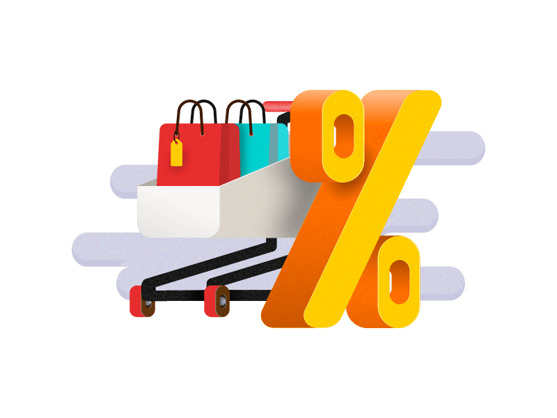
Every day more and more websites are created, including online stores from different segments. So, it doesn’t matter if you are a small, medium or large business, you have to improve your online store’s user experience in every step of the purchase flow. After all, if your cart abandonment rate decreases, you will sell more and increase your revenue.
According to the Baymard Institute, the average documented online shopping cart abandonment is 69.89% globally. They have used 40 different studies containing statistics on eCommerce to get this average. Not just that, they went further to understand the motivation behind users’ behavior. The institute conducted the research in the United States by asking online buyers the following question: “Have you abandoned any online purchases during the checkout process in the past 3 months? If so, for what reasons?”. Let’s check the results below:

It is possible to notice that many of the reasons why consumers were abandoning the online purchase process reveal problems that can be fixed with design changes and UX improvements on the websites. We’ve selected five reasons to go deeper and explain how you can boost your conversion rate and cut down your cart abandonment significantly. Our selection was due to the relevance in the users’ responses and intrinsically related to UX. The reasons are:
- The website had errors / crashed
- I don’t trust the website with my credit card information
- The website wanted me to create an account
- A too long / complicated checkout
- There weren’t enough payment methods
After reading this article you will be able to increase your conversions and revenue. Do not spend your time and money on something that will not help your business growth. Focus on our tips and expand your business.
1. Try not to redirect your customer to finish their purchase
When your customer chooses a product and starts the checkout flow, try to keep all the payment information on the same page without redirecting them to another environment. Redirection is useful when done right: your website has a quick page load and the design does not vary from your site.
If it’s done any other way, your website could show an error or crash in the middle of the redirect process which is very frustrating for someone interested in purchasing a product or service from you.
When you avoid redirection, you are potentially helping the 20% who answered “website had error/crashed” as the reason to abandon checkout pages. It is a notable percentage that can help increase your conversion rates.
2. Use your customer’s language
As simple as it may seem a bunch of websites, even the largest retailers, do not translate their website correctly; which is a relevant decision point. When your website is available and indexed on search engines, anyone from anywhere in the world can reach your content. It is a huge mistake thinking that English is enough because it is not.
Many studies highlight that most users are more likely to purchase if the content is available in their language. As Common Sense Advisory demonstrated with researches, 72.4% of customers spend most of their time online on websites with their native language. You must identify your audience, using Google Analytics or other tools, to understand which language you must invest in.
And the translation needs to consider cultural aspects since words can be used differently in different countries. Let us give a simple example of translating a word into Portuguese. According to Merriam-Webster, “bag” means, as a noun, a usually flexible container that may be closed for holding, storing, or carrying something. In the online commerce world, it can be used to indicate a “shopping cart.” But in Portuguese, depending on the chosen translation, your website may be indicating bag as “trash bag,” “purse” or even “carrier bag.” Everything but a shopping cart.
However, leaving your website in English is not an alternative because, as reported by British Council – British organization specialized in international cultural and educational opportunities -, 5% of Brazilians speak English and only 1% have a reasonable degree of fluency. So, ward off misunderstandings and spend your time investing on translation; you will be definitely ahead of the competition.
3. Focus on the purchase experience and nothing more
You have probably read or heard that “less is more” and that sentence could not be more true for checkout pages. As we see on Baymard Institute’s research (graphic above), the second reason that makes users give up purchasing online is “The site wanted me to create an account”. So think twice before adding buttons, images or texts; each one of these elements leave the page more complicated for the user to understand what they need to do. If the desktop experience is bad, it will be worst on mobile devices.
Put yourself in the users’ shoes and imagine the following: when you are trying to buy something and you have already decided, all you want to do is to complete the purchase, not to see adds or to create an account or any other action.
If you provide a good user experience, your customer will return to buy again and you will have time to invite them to create an account on your website. Remember: Keep only what is absolutely necessary.
4. Eliminate useless fields
After avoiding the page redirect, trying to speak your customer’s language and focusing on what really matters, our fourth tip is to complement what we saw before. As 28% of users responded that a “Too long/complicated checkout process” makes them give up the purchase, you must cut out all unnecessary fields from the purchasing flow.
Try putting 7 or 8 fields maximum, such as name, address, street number, a zip code field that automatically loads Country and State, ID number, and payment information such as credit card number, CVV and expiration date. With those, you have the essential information to complete a purchase. If you want to suggest products according to users’ preferences, try sending emails with questions, explaining your will and the gain to the customer when they answer it. There are always smarter and more fun ways to collect information.
5. Offer local and international payment methods
Knowing your audience and understanding their behavior, you cannot forget to offer and show on the checkout page, their preferred payment methods. “There weren’t enough payment methods” cannot be the reason why your sales are decreasing. Search for a business partner that can help you with this. You enter with the business and your partner helps with the payments processing.
EBANX offers over 100 payment solutions from Latin America, including installments, meaning the total amount due is split up into monthly payments that fit into budgets of all sizes. Payment methods such as this one are extremely important in Latin America, a huge market to explore and that is not supersaturated as the United States or in some segments in Europe.
All these tips were given to get your attention to your website’s user experience because pricing and products/services are differentiators, but not for too long. According to Pointsource “By 2020, the user experience will overtake these attributes as the most important brand differentiator”.
Many research institutions, including those we mentioned before, and companies related to the industry have also gained traction in the subject by studying the data collected from users and understanding what kind of purchase flow is the best when it comes to conversion rates.
By making use of our five tips, you’re not just decreasing your shopping cart abandonment rate, but also:
- Increasing your conversion rates
- Saving money
- Getting recurrent customers
- Staying ahead from your competitors
Less efforts with many gains. No matter where in the world your eCommerce operates in, user experience should be front and center today and from now on.
[author] [author_image timthumb=’on’]httpss://thepracticaldev.s3.amazonaws.com/uploads/organization/profile_image/359/7ba5799b-251a-46fb-aa67-a9812360d15b.png[/author_image] [author_info]About the authors: Gabriela Antunes and Manuela Pereira are respectively product marketing and business analyst inside the Product Team of EBANX, a global fintech company with Latin American DNA that offers local payment solutions from Brazil, Mexico, Argentina, Colombia, Chile, Peru, and Ecuador to global merchants eager to expand throughout the region. Antunes and Pereira use their expertise in product and marketing strategies and in Latin American local payment methods to help digital commerce merchants succeed in the region’s market.[/author_info] [/author]